
Your Resource For Everything Cars
Welcome to GearShifters
A Guide To Purchasing Cheap Car Accessories
Modern day cars are not just meant to be driven around to reach a destination�.
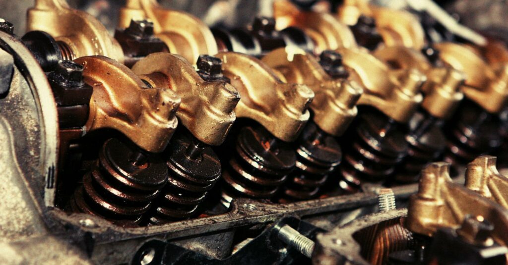
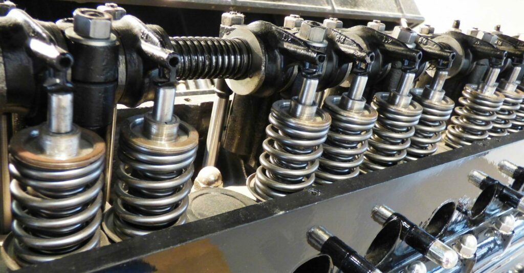
Car Engine Oil: The Best Way To Change It Is Free
I have read a lot of how-to articles about changing car engine oil. Those with�

Car Buying Guide for Women
Why would women need to do anything different than men? The sad (but true) fact�
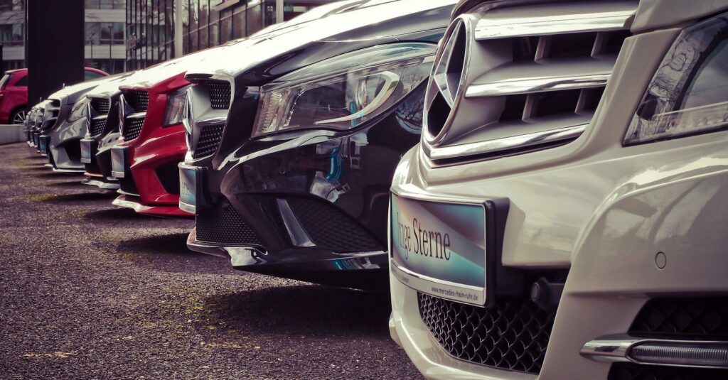
Why Used Cars Are More Efficient Than New Cars
We currently live in a society built upon excess, and buttressed by the status quo�.
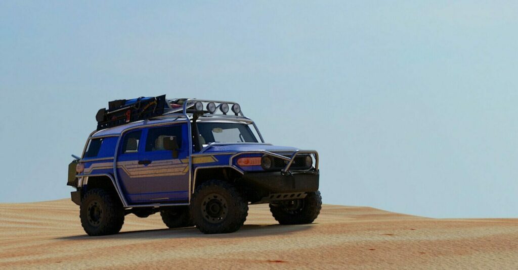
A Guide to Four Wheeling and ATV�s in Utah
I�m converted to four wheeling. Having not understood why people would travel long stretches trailing�
Four-Wheel Tour of Beef Basin in Southeast Utah
Located just to the south of Canyonlands National Park on the east side of the�